POP 1: Part 3 – Portrait and figure – Ex: Telling a story

For this exercise I had to create a simple narrative through a painting that gives a clear idea of what is happening.  Unfortunately, I had to work from a photo but rather than working straight from it (previous use of photos has proved inaccuracies) I decided to make a sketch from the photo: a view looking down on a small child feeding potato to a hungry cow.

IMG_0936

I was really pleased at my representation of the photo, particularly the angle, and I used a simple 10 box grid to help transfer this onto acrylic support.

Light was coming from the left casting shadows to the right. IMG_2028

I am really pleased with this: the angles, the tones, the shades and yes the cow too. I used a dry sponge to try and show the pits and roughness of the breeze blocks on the wall. As with the other painting of the child, I painted  the skin – mixed with retarder – in opaque layers to give the shadow.

POP 1: Part 3 – Portrait and figure – Ex: A figure in an interior

For this exercise, my model was happy to help by working on her laptop as she usually does and with her ear phones in she was able to ‘zone out’ and maintain a comfortable position while I could draw her. I used natural light but because my model couldn’t stay in bed indefinitely I used a photo to help with some of the tones.

I started off with a drawing:

IMG_0905

When I came to painting this I decided to  grid the sketch but I wanted to focus on the model:

IMG_0905

I chose these elements of the sketch as I thought the figure being ‘off-centre’ might  make it more appealing. I enlarged the sketch to A2 size and used acrylic paper.

IMG_0906

I started work on the different grounds with some under-painting as I hoped it would help me when it came to reflecting these tones on the skin.

IMG_0907

I have to confess that I was intrigued by the way the light was so strong and how the pink and greens made the skin quite different in the shadows; I was determined to capture them as accurately as I could.

IMG_0933


Although the photo doesn’t truly reflect the depth and colours of the real painting, I am very pleased with this; even though I didn’t do much in the way of pre-sketching I am going to keep this in mind for an assessment piece. I love it!

POP 1 – Part 3 – Portrait and figure – Ex: Conveying character

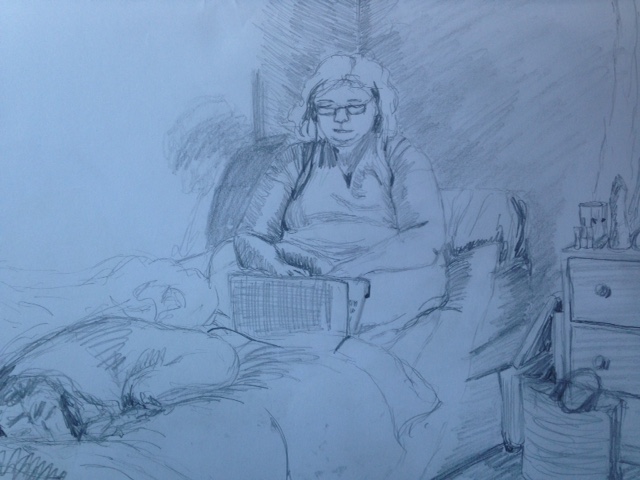
For this study I  used another photograph to convey character through facial expression. Having found it so difficult in achieving a child’s face in my last exercise, I decided to use a child’s photo and work it in acrylics.

In my acrylic portraits so far I have used the following colours:

Flesh Ochre, Titanium White, Carmine red, Vermillion, Yellow Ochre, Burnt Umber, Cerulean and Phthalo Blues and I continued with these.

I wanted to achieve a smoothness of the skin whilst maintaining the young age of the child. I used acrylic retarder so I could blend colours in situ but I didn’t start so well (forgot to take photos of progress too) and at the end of day 1 I was ready to jack it in!

I think this was because I had under painted in the hues and tones that I could see in the photo  but again I was stressed over it becoming  adult- like and I couldn’t think of how to bring the curves and gentleness of the face to the fore. I put it away to dry.

Another day! I’d had a chance to think about how to blend all the colours to give an appearance of  smoothness. With baited breath I used some Flesh Ochre mixed with retarder to give an opaqueness to the colour and then painted over the face – it had the effect I was after.

This is how I have left it until tomorrow – one photo is with flash and the more yellow one is without:

Well tomorrow is here and I’m going to start by adding the background as I feel it may influence how I finish the portrait. I’ve chosen a green gradation and this has enabled me to pick up shadow under the face and to improve the accuracy of the hair colour as well as  picking out tiny features that weren’t really evident before.

GG final

I feel that this is a successful work in that it captures the inner feeling of the child in addition to giving movement to the face and showing how the muscles move to convey smiling and joy. Overall, I’m really pleased with this and so far would say this is my best attempt at a portrait. Technically, this is much improved on my other attempts: by trial and error, I’ve discovered how to mix and handle the paint to achieve the movement in the face while still keeping the smoothness of the skin to portray the young age of the child.

POP1 – Part 3 – Portrait and figure – Ex: Creating mood and atmosphere

During my research I was impressed by Picasso’s ‘Blue Period’. I had a photograph that I thought would really be really effective in a similar style and that would lend itself to the title of the exercise.

I decided to use a different media – watercolour – and one blue.

I did use a grid for this and measured it out correctly but you can see from my first attempt the failings of the photo were quite evident:

Well this was where I started,  the eyes in the male and the face of the child are wrong – even though the grid was accurate. Fortunately, I had some very good quality watercolour paper enabling me to lift colour out as required without damaging the support.

IMG_0860

Here I have improved the eyes of the male giving him a less flat look; I also had a go at improving the child but I really found it hard not to make her look  like a mini adult.

IMG_0900 (1)

This is a much better version of the child: I wanted to give her depth but without the angular features of an adult. I expect there is more I can do to enhance it however I need to do something else for a while.

POP 1 – Part 3 – Portrait and figure – Ex: Head and shoulder portrait

I was struggling for a model in this exercise so I resorted to a photograph and shamefully I used a grid to get the proportions as my emphasis was on achieving colours and paint consistency.

I was very pleased with my efforts here. Viewers might say that the face is is very ‘pink’ but truly it was. I’m delighted with my take on the hair as well as the shoulders; this is a view ‘looking down’.

I used a greyish background to emphasise the face and shoulders. The subject approves.

POP1 – Part 3 – Portrait and figure – Ex: Self- Portrait

For this exercise, I had to make a self-portrait of my head and shoulders and it was as difficult as I thought it would be.

Because of the time of year, I’ve had to rely on artificial light which has I believe impacted on the final results.

I started off with some drawing:

IMG_2027

This was freehand, no gridding. I liked this view but vanity got the better of me; I didn’t really want the saggy bits!  I had a go with a photo, gridding and a different angle:

IMG_2026

It’s true what they say about the distortion from a photo. I decided to have ago and moved onto A2 support and went freehand:

IMG_2029

I didn’t follow any proportion guidelines and it shows; I used a retarder with the acrylics for this but I was unhappy with the brush work and in the end resorted to using my fingers on the support to blend.

I decided to try again but this time to use the proportion guidelines and I was really pleased with the initial sketch:


IMG_2593 (1)

From this sketch I went on to paint with acrylics. I used some with retarder and some without:

IMG_0898

It looks quite rough and I’m still not sure about the eyes and the mouth and I think I’ll return to them later when I’ve practiced more with other portraits.

Well I’ve left it for a while and returned to it again:

ros first self portrait final

I’ve added a layer of flesh ochre mixed with retarder as well as redefining the shape of the face. Also. I’ve added more colour to the eyes and softened the lips. This is more like me!

POP – 3: Portrait and figure – Exercise: Tonal figure study

For this exercise, I extended some charcoal drawings that I had used in the Drawing 1 module, which were based on a Degas pastel of a model in a similar pose:

Image result for standing nude edgar degas pastel on paper

Degas.E, c1886, Standing Nude, Pastel on Paper


Even though I couldn’t use those sketches for this module, I really wanted to take the work further using a restricted palette of acrylics:

IMG_2613

I’m really pleased with it, however I do need to get a better grip on acrylics to give a smoother finish. In this work, I have tried diluting them just with water but they dry so quickly it’s difficult to blend them insitu; I’ll try them with a retarder next time.