The subjects I find most interesting to paint are trees and the beach. I’ve often portrayed trees but not so much the beach – purely because it’s less accessible. During recent holidays on the coast, I was able to take photos and make small sketches and watercolours of beach scenes. Consequently, I have decided on this as a theme however I’m not quite sure of its actual title.
Initially, my first thought was to move from small to large, each containing an element of collage.
Incoming tide
The smallest piece was originally going to include a group of shells as a still life, in reference to the first parts of the course so I made a number of sketches:
Then a number of ‘poses’ at different levels:


I had a piece of thick card on which I applied three layers of gesso to protect the card. My intention was to create a small 2D beach scene of shells with acrylic paint on tissue and to use pva, sand and gloss gel for the surrounding area. Once I started however, it became something quite different:

My creation became 3D with the oyster shells being collaged from multiple layers of tissue paper with pva and layers of torn crafting paper with pva. The two limpet shells (of which I’m particularly proud) were created differently: the shell on the right was a limpet shell covered in cling film which then had gloss gel applied over the top and ridges styled manually. The shell on the left was multiple thin strips of waxing fabric layered across the shell with pva. When it had all thoroughly dried, I painted it with acrylic and glued it all in place and started adding the beach area.

Having decided which way the tide was going to come up the beach, I added multiples of pva and sand to give a further layering effect:

I added some blue – green acrylic with eggshell to the bottom left hand corner and then (in another experiment) applied the clear gloss gel attempting to recreate the foam of the tide. As this dried, I pricked a few holes in the gel to make it more realistic, applying white acrylic in varying layers to accentuate the depth of the foam and movement on the sand.
This is the first of my final pieces of which I’m incredibly proud and will start my trio off well.

Incoming Tide
Fresh Fish
For my second piece in A3, I decided to create a piece that referred back to one of the previous sections where an example was shown of a painting of some mackerel on a plate. I wanted to include some ‘wet’ fish – not on a plate but in newspaper as it would have been wrapped if you bought fish straight from the boat.
I crumpled up some sheets of newspaper and made some charcoal sketches of them.


I wanted this second piece to be more painting than collage so I laid down a layer of a brown acrylic (planning to have an old table surface as the base) and then painted the entire shape of the crumpled paper in a blue-grey. Using the highlighted areas of my sketch, I adhered pieces of newspaper to these areas that would later form the crumples and folds. Then I added some black lines to help me remember where different shapes were.

With the palette knife, I continued adding blue-black acrylic for the shadows and lighter shades of blue-grey for the lighter areas followed by some yellows for greater emphasis.


All I need now is the fish! The trouble I had with that! There weren’t any to be found when I wanted them so I had to rely on internet images. I made a quick sketch and honed in on the colours and patterns in the photos:
Once I’d added the outline to the background with white crayon, I used a tight sponge with diluted acrylic to dab on the main skin tones.

The softness of the pattern on the fish has made a great contrast to the jagged crumpled paper surrounding them.

I then progressed to adding the patterns: a variety of blues and blue-greys for the bodies while the faces have a wonderful mix of yellow, oranges and reds.

Fresh Fish
I’m not yet sure if this is what I had in mind for the finish however the contrast between the paper and fish does work.
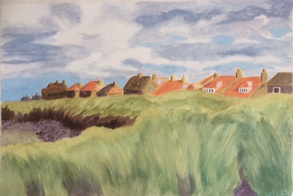
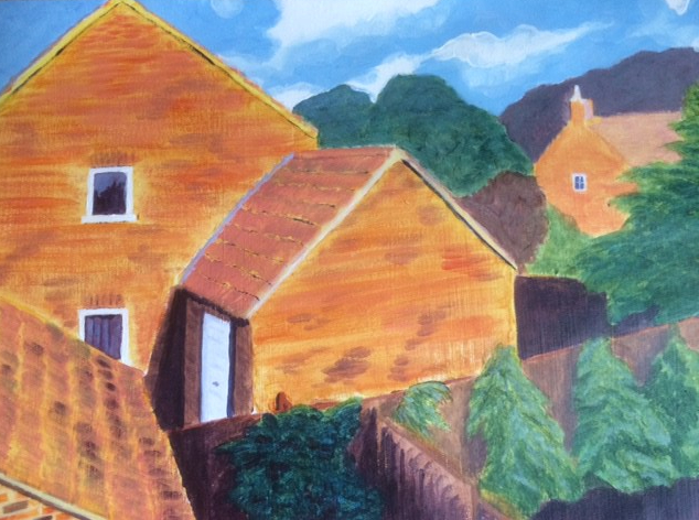
By the Sea
For my third and final piece I chose an A2 landscape on which I wanted to include a variety of methods of collage in one part, reducing as it worked across.
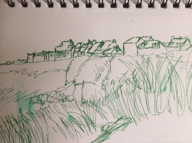
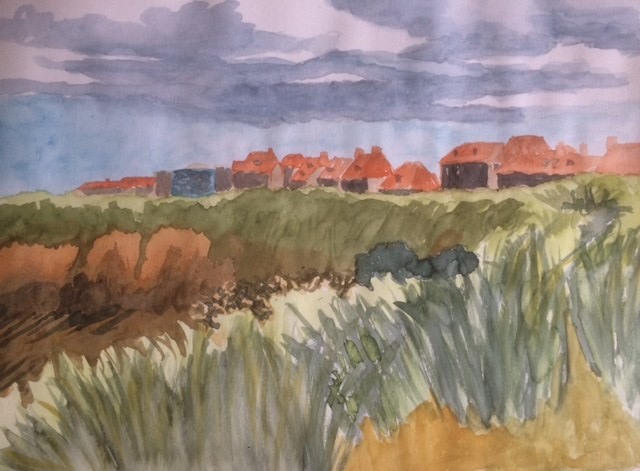
I was working from some photos and sketches I’d taken whilst on holiday at the coast.
Before I started sketching or taking any photos, I referred back to some research I’d completed in Part 4 regarding the ‘Rule of Thirds’ while deciding when to place my main focal point.
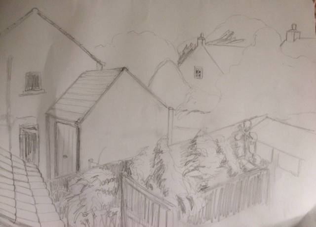
Having made my decision I made a larger sketch with a few notes as to what, where and how I’d like it to take shape:

Once I’d made this sketch, I researched three different artists and how they achieved fabulous artworks through use of paper and application of colour; I was determined to include elements in this picture that reflected my learning as well as the excitement and pleasure that it had given me.
John Piper, was an English painter who created some wonderful coastal scenes through collage with printed paper and paint. I think I’m drawn to them because he is described as an ‘abstract’ artist, however they are incredibly ‘real’ to me and evoke the place they depict:

Piper J, 1933-34, Beach with Starfish
He created a number of these styles of collages which I find inspiring:
This slideshow requires JavaScript.
The second artist is Amy Genser who creates a different type of texture with paper:

Genser A, Ocean Reef comprised of rolled paper
The movement she gets from positioning, colour and varied heights of the rolls is quite amazing.
The third artist that I researched is Karl Schmidt-Rottluff who had a wonderful eye for using complementary colours successfully, enhancing quite simply styled pictures into beautiful, warm paintings:
This slideshow requires JavaScript.
I found the colour combinations the artist used in these three paintings really warm and inviting. Before I could proceed, I made some practise sketches using these schemes before deciding how to move on:
This slideshow requires JavaScript.
My colour preference was for the orange fishing boat colour scheme.
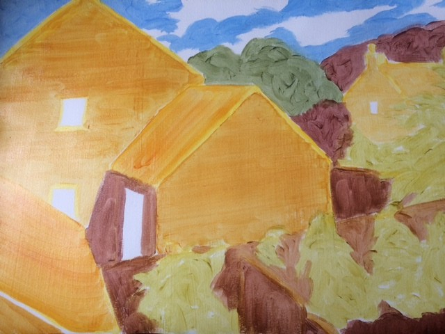
Not quite sure how I was going to create this painting, I started with a normal blue sky, adding some collaged areas to the main focus (to the left middle area where research suggested the eyes are automatically drawn when looking at paintings).

Then, I decided to add the colour by starting with a yellow to cover the whole of the sky and then an orange so I could add sgraffito to give the sky an effect:


I built up the rocky areas to the left and the groynes to the right with craft paper and newspaper while the boat had strips of material layered on to add body and grooves to the boat. From then on I added, layers, textures and paint using colours in a similar way to Schmidt-Rottluff:


I thought that the sea needed some more obvious movement, even though the base colours were applied in a wave motion. The middle area needed breaking up so I applied some sand in acrylic while the foreground had a coat of gesso with crushed egg shell. Throughout, I tried to mirror shapes, positions and colour to give a balanced result.
My completed final piece:

By the Sea
If I compare all the parts of this course, I have been most inspired by the final two parts which have allowed me to work outside and to utilise the skills practised in the first two parts. This final part has been the icing on my cake: I’ve loved every minute of it and I feel I have truly discovered what it is that I find exciting and really interesting – colour and texture. During parts three and some of four I was struggling: I think because I felt restricted – I was working on Drawing 1 at the same time where both the research and exercise elements in both parts were very similar and found that drawing was much more fulfilling than painting. Latterly and certainly in part 5, I have been invigorated and am now confirmed to carry on the Painting pathway.
Self Assessment
Assessment criteria points
- Demonstration of technical and visual skills – materials, techniques, observational skills, visual awareness, design and compositional skills.(35%)
I am so pleased with these three pieces! In my opinion, the proportion, perspective and composition in all three work well. I have worked in varying sizes with different aims in mind. As my first attempt at producing more than one piece with a running theme, I think that I have really worked in new ways and with different materials to produce these pictures: in 2D and 3D, with new textures and collage techniques that reflect my observational skills; I’ve also been impressed with my own imagination in all three, which are all quite different. The research that I carried out as required was very interesting and led me on to follow it up myself, which has resulted in something quite different to what I had originally envisaged when I first read the brief.
Demonstration of creativity – imagination, experimentation, invention, development of a personal voice. (25%)
I feel I have tackled:
Imagination – probably more so in the first piece by making it 3D, although a small part of me is wondering if it’s collage now or more assemblage. Regardless of that, I taught myself to create it all and am proud of myself for the incredibly detailed result. In piece two I used my imagination to work out how to create a 3D look in a 2D style and in the final piece how to turn an ordinary beach scene into something so colourful and interesting.
Experimentation – each piece was an experiment: every time I added something I wasn’t convinced it would work – even though I’d experimented in my exercises and sketchbook previously. However, the support I used on the large work (acrylic paper) has struggled to cope with the multiple layers of glue and paint applied and shows signs of buckling in places.
Invention – through necessity here. In my head I could see where I wanted to go and what I wanted to achieve but in many instances it was difficult to ‘draw’ it beforehand: the flatter shells for example were created from tissue and pva, craft paper and pva while the limpet shells were from making my own mould of the shells – one with gloss gel and the other with material strips and pva.
Development of personal voice – in the majority of exercises in this section, I’ve discovered a way of working with paint and colours that I hadn’t encountered before but that have improved my work. For uncertain areas, I have sought out solutions through research and experimentation. This part of the course has been the most interesting and has made me realise how much more the use of collage and texture can add to my work – making this one the area I’ve truly enjoyed more than anything – reaffirming my commitment to carrying on the Painting pathway.
I’ve used knowledge gained in my research for exercises and beyond to enhance the quality of the work and used colour to evoke interest. I understand much more how acrylics work with other mediums and supports. I feel that all the pictures work well as a theme – focusing on three different nautical aspects. I’m incredibly impressed with the finished pieces and only wish these exercises had come earlier however as research was such a strong element within these pieces they probably wouldn’t have been quite as effective.
Context reflection – research, critical thinking (learning logs and at second and third level, critical reviews and essays)(20%).
- In the last part, I learned about the Rule of Thirds, which was very important when it came to planning my final piece. I found all the research I did extremely interesting and enjoyed reading further into some of those I’d discovered as well as finding some others not named in the exercises; certainly, for my largest piece, I was able to use influences from their works to help me with mine. I was equally pleased to find other students reading my research and making positive comments.
- I discovered how truly effective complementary colours can be; how different tools can be so effective in the right setting and how working outside my ‘norm’ can give incredibly interesting and exciting results.
- The use of the exercises, sketchbooks and research has been incredibly supportive and important when creating my work in this section.
Image references
Tate. (n.d.). ‘Beach with Starfish’, John Piper, c.1933-4 | Tate. [online] Available at: https://www.tate.org.uk/art/artworks/piper-beach-with-starfish-t05030 [Accessed 25 Nov. 2018].
Tate. (n.d.). ‘Littlestone-on-Sea’, John Piper, 1936 | Tate. [online] Available at: https://www.tate.org.uk/art/artworks/piper-littlestone-on-sea-t00646 [Accessed 25 Nov. 2018].
Tate. (2018). John Piper – Exhibition at Tate Liverpool | Tate. [online] Available at: https://www.tate.org.uk/whats-on/tate-liverpool/exhibition/john-piper [Accessed 25 Nov. 2018].
Tate. (2017). Members Curator Talk: John Piper – Tour at Tate Liverpool | Tate. [online] Available at: https://www.tate.org.uk/whats-on/tate-liverpool/exhibition/john-piper/members-curator-talk-john-piper [Accessed 25 Nov. 2018].
Towner Art Gallery. (2011). John Piper in Kent & Sussex | Towner Art Gallery. [online] Available at: http://www.townereastbourne.org.uk/exhibition/john-piper-in-kent-sussex/ [Accessed 25 Nov. 2018].
Fischler, S., Fischler, S. and profile, V. (n.d.). Textural Paper Art from Amy Genser. [online] Eclectitude.com. Available at: http://www.eclectitude.com/2012/03/textural-paper-art-from-amy-genser.html?m=1 [Accessed 25 Nov. 2018].
Masmoulin, artiste passionné et sa “bible” de l’Aquarelle, explore aussi l’art moderne et l’art contemporain. (2011). Karl Schmidt-Rottluff. [online] Available at: http://masmoulin.blog.lemonde.fr/2011/12/05/comment-peindre-la-mer-%E2%80%93-partie-11-les-peintres-modernes-et-contemporains-p-a-z/karl-schmidt-rottluff/ [Accessed 25 Nov. 2018].
Kettererkunst.com. (2013). Ketterer Kunst, Art auctions, Book auctions Munich, Hamburg & Berlin. [online] Available at: http://www.kettererkunst.com/details-e.php?obnr=411300498&anummer=406&detail=1 [Accessed 25 Nov. 2018].
art.com. (n.d.). Fischerbucht, 1937 Art Print by Karl Schmidt-Rottluff | Art.com. [online] Available at: https://www.art.com/products/p10382184-sa-i798796/karl-schmidt-rottluff-fischerbucht-1937.htm [Accessed 25 Nov. 2018].
Yaoota.com. (n.d.). Mackerel Fish /kg. [online] Available at: https://yaoota.com/en-sa/product/mackerel-fish-kg-price-from-danube-saudi-arabia [Accessed 25 Nov. 2018].