Feedback POP Tutor Reports
Assignment 1
4/2/17
Hello Hilary,
Thankyou for your speedy and positive feedback to my work.
I appreciate and understand all you have said and will take it all on board. I would like to confirm that I am working towards the degree in full.
There are one or two things that I’m a little confused by though which I’m sure you can explain:
1. The works I sent you were just exercises for Painting 1 and in fact I haven’t completed Assignment 1 yet, unless of course you feel something I have sent you actually meets that criteria.
2. Should I just go onto the next set of exercises and Assignment 2?
3. I am running Drawing 1 alongside Painting 1 for which my tutor is Hayley Lock. This is why you have not received those drawings as they have gone to her for assessment , however I am much obliged for your positive comments. The drawings were in fact all A2.
4. In future do you want to see my work for Drawing as well as Painting? If so, I’ll make sure I stagger my deadline dates?
Perhaps you’d be kind enough to clarify my queries.
Once again many thanks for your constructive and confidence building response.
Kind regards ,
Ros Townsend
5/2/17
Dear Ros
Thank you so much for your email.
1- The first assignment is not submitted for the degree – it gives me a strong idea of your work as you begin this new challenge and shows you how my review works. I took the bottle and glass as your final painting.
2- In future could you send me all your practical work by post ? In this way there will be no confusing of modules on your blog.
As far as I am concerned your 1st assignment has been completed so you must now concentrate on the second assignment.
3-Clearly define your writing part on your blog as relevant to painting so there is no confusion which module the writing relates to.
4-It would be highly unprofessional if I knowingly reviewed any part of another module that you were completing with another tutor.. .
5-Just take note of my comments I made in my 1st review relating to the painting assignment. Together we will make sure that your paining develops as much as it can so your progression will lead to a successful formal assessment.Good communication is imperative and this has already been accomplished.
best wishes
Assignment 2
20/8/17
Hello Hilary,
Thank you for your feedback with constructive comments and points for improvement; I will take these all on board.
I don’t think there is anything I wish to query except to say that on one of my exercises and on my assignment piece you seem to think I have used black. I can definitely say that I have not used black on either of these pieces; I have just tried to mix dark tones.
Kind regards,
Ros Townsend
Dear Ros
I will note the correction and apologise for misreading the color!- well done – a very dark intense alternative .
Assignment 3
14/2/18
This was a Google hangout with my new tutor Ilsa Brittain so my feedback was given during the online session.
Assignment 4
23/8/18
Response to Tutor Comment -POP Part 4
Hi Ilsa,
Thanks for your feedback
Thanks for your feedback
Writing a review- I’m sorry – I presume this was Rahul Dufy etc? I did research these artists but as it didn’t stipulate about writing I didn’t- obviously my misunderstanding- I’ll make sure it’s done. Apparently, this was to write an Exhibition or book review – an appendage to the course of which I was not aware at the time. Since then however, I have completed the required review and posted it online but it has not been reviewed by my tutor.
Project 1
E1
I did use odourless spirit but in spite of windows, doors open and a breeze I still suffered from the fumes. Thankyou for the alternative underpainting choice, I will explore it.
E2
I see what you mean about the receding tones in that dark area. The thing is – they were very dark and I felt that they helped to identify the curved nature of the sea wall/bank – however I do understand what you’re getting at.
Project 2
E1
This is a painting of Richmond and to be honest the road does tilt slightly. My aim was to show that the one way road had worn away where the years of cars had driven up it and that this had left a darker, raised area in the middle which was less travelled.
E2
In this exercise my intention was to show a focus change from the bottom left hand corner and then moving outwards from there? Are you saying that the trees to bottom right are too soft for the distance covered?
Project 3
E1
I really enjoyed this and was surprised at how well it had materialised.
E1
I really enjoyed this and was surprised at how well it had materialised.
Project 4
E1
I’m pleased this worked out as well as it did, I didn’t vary the colours for fear of spoiling it – it was watercolour and I tried not to muddy it.
E1
I’m pleased this worked out as well as it did, I didn’t vary the colours for fear of spoiling it – it was watercolour and I tried not to muddy it.
Project 5
E1
Isn’t it strange how one persons opinion of something differs from another? I was fully expecting you be quite negative about this but it’s clear by your comments what makes it a successful painting and I will keep this in mind for future reference. Thankyou
E2
Yes this was entirely my own fault for not ready the instructions properly to begin with.
Assignment
I really wasn’t sure what you’d think of this. I’m pleased with virtually all of the picture especially the sky and water as they always seem to have been my nemesis. I also wasn’t sure if the bridge was too horizontal but it was what it was and overall I’m pleased with it.
I really wasn’t sure what you’d think of this. I’m pleased with virtually all of the picture especially the sky and water as they always seem to have been my nemesis. I also wasn’t sure if the bridge was too horizontal but it was what it was and overall I’m pleased with it.
Research
Would it make sense for me to go back through my research and expand them by adding the responses you suggest or just to do it when I’ve finished my exercises and assignments? One of the reasons I have applied for March assessment is so that I will have time to add these sort of things if thought beneficial.
Would it make sense for me to go back through my research and expand them by adding the responses you suggest or just to do it when I’ve finished my exercises and assignments? One of the reasons I have applied for March assessment is so that I will have time to add these sort of things if thought beneficial.
Sketchbooks
Even though I’ve been doing this for two years I still find it difficult to reason what sort of thing should go in them. Is is my preparatory work? If so how do I use it if I want to send it for assessment? Also, I’ve been working on Drawing 1 simultaneously and I’ve used the same sketchbooks for both which now is going to cause a problem with separation ready for assessment.
I’ve used them for skills practise, making observations and looking at other artists but there isn’t a great deal else in them�
Ros
24/8/18
Hello Ros,
I’m glad you found the feedback useful.
About the research – For your own benefit I would suggest you clarify your thoughts about the work you have looked at, but perhaps you do not need to do it for all – choose those works that you have particularly admired or reacted to.
Sketchbooks – I’ve added an OCA pdf that might give you some ideas. You do need to have separate sketchbooks for the different courses. It is expected that you will have preparation work for the exercises within them. The main purpose of developing a sketchbook practice is that you establish a place you go to to explore, to analyse, to work things out, to collect etc. There are no rules as such about what should be in them but they should help you develop your skills, your visual vocabulary and your voice. This is not a place to show off what you can do – it is a place where you can bring together all your fragments of inspiration, the beginnings of ideas, a place to hone your skills, analyse what you are looking at, explore what your mediums are capable of.
I hope this clarifies things a little,
All the best,
Ilsa
28/11/18
Assignment 5
Response to tutor feedback POP Assignment 5
PROJECT 1 Different ways of applying paint
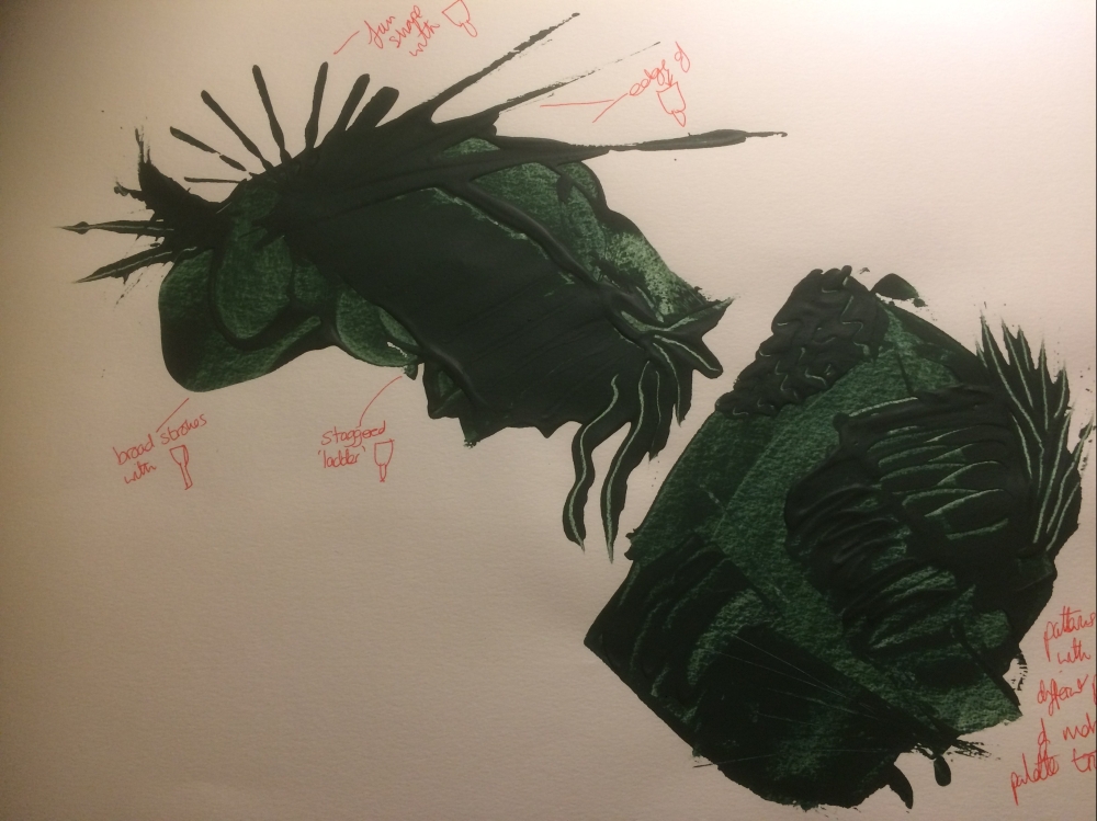
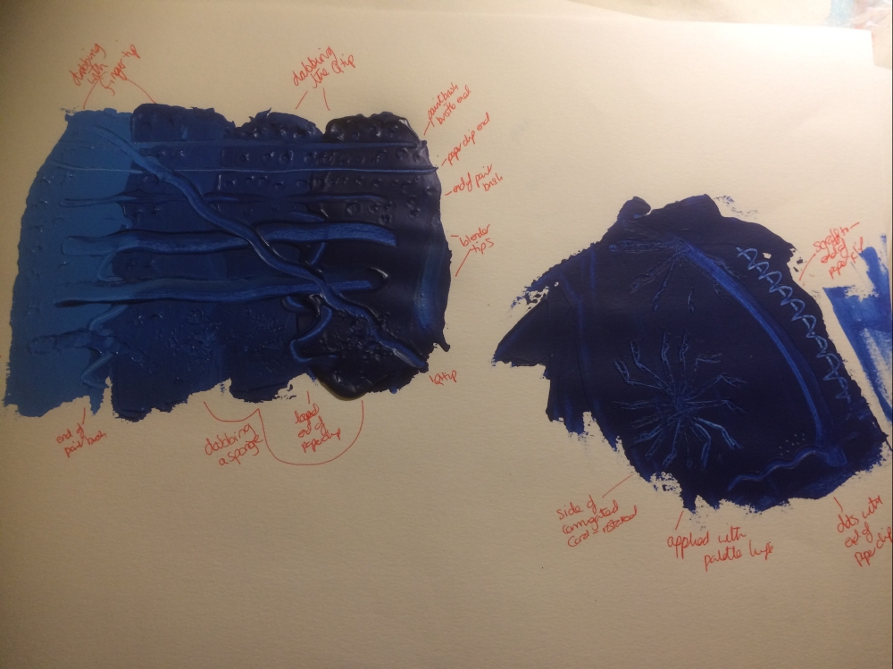
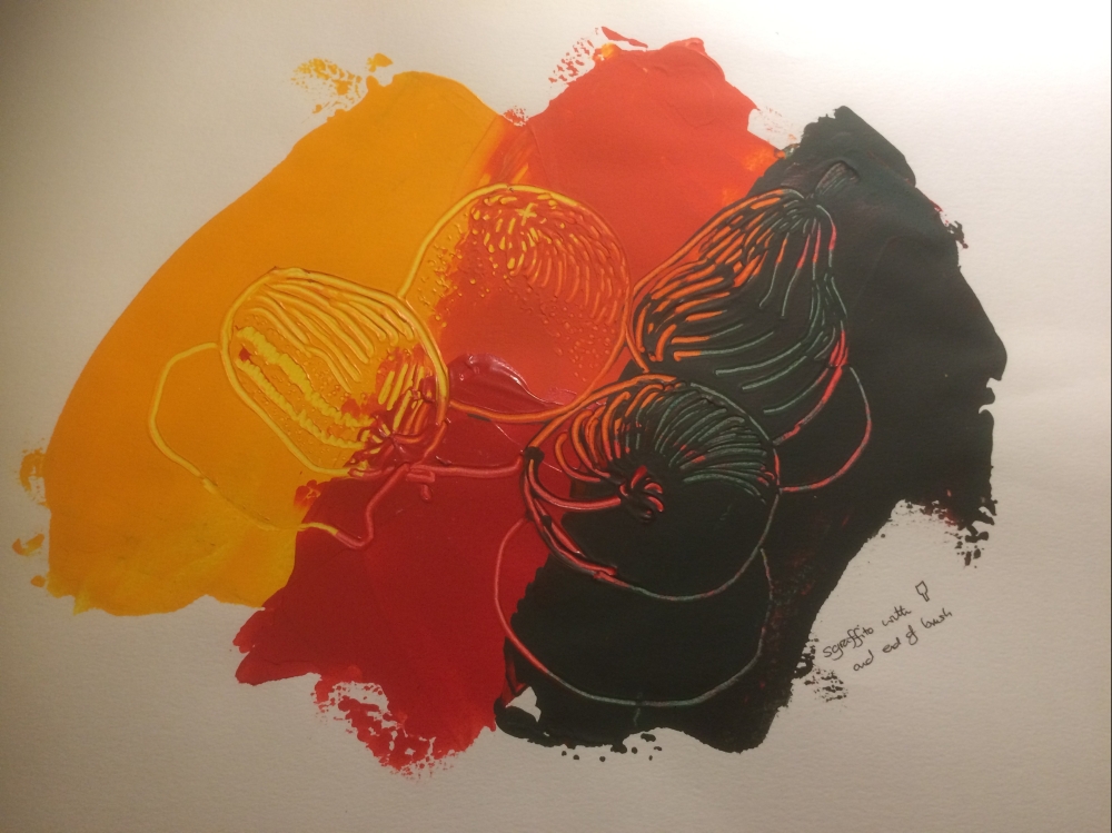
E1) Impasto
I’m not sure you have found your way to incorporate these techniques into your own practice yet, but it is evident that the experience is opening your mind to the possibilities.
E1) Impasto
I’m not sure you have found your way to incorporate these techniques into your own practice yet, but it is evident that the experience is opening your mind to the possibilities.
It was my intention to make the first of my three assignment pieces Impasto however this didn’t quite work out that way. I hope to have time to add another piece before assessment.
PROJECT 3 Towards abstraction
E1) Abstraction from study of natural forms
You made some interesting work and made some good observations about the results in
order to find the direction you wanted to go. However, I feel you started the journey but didn’t complete it.
E1) Abstraction from study of natural forms
You made some interesting work and made some good observations about the results in
order to find the direction you wanted to go. However, I feel you started the journey but didn’t complete it.
I agree. I don’t know why but I just couldn’t make it more abstract yet the man-made piece was much more effective!
ASSIGNMENT Five
You have embraced this assignment with enthusiasm and determination and as a result
produced some good work – good for you!
The three pieces are connected by theme but not so much by style. However, at this stage
on your journey, it is so much more important that you explore and experiment than restrict yourself to a particular style, so I applaud your diversity. It is evident you are learning a lot and coming up with interesting and successful solutions and strategies for making your work.
I made a conscious decision to make each piece differently, exhibiting a variety of skills that I was interested in but that also reflected what I’d learned.
The first piece – You employed a lot of different techniques to get the textures and colours
you were after and came up with a convincing image/sculpture of limpets on a beach.
However, the overall feel is a little one dimensional and crafty, and there is little room for interpretation – it is what it is. This is an aspect of how an artwork operates that is important to understand – often it is the ambiguity and incongruity which is most appealing for a viewer as they try to untangle the mystery. This piece is quite impressive with its depiction of reality but is not particularly engaging.
This was not the piece I had imagined in my mind at all! I had intended to portray a similar them only via impasto. I hope to add another piece in this style before my assessment.
Sketchbooks
You didn’t put images of your sketchbook under a separate heading on your blog (as I
asked), so I cannot offer you specific feedback. Please do refer back to my previous
feedback.
You didn’t put images of your sketchbook under a separate heading on your blog (as I
asked), so I cannot offer you specific feedback. Please do refer back to my previous
feedback.
Yes I’m sorry but I just didn’t get the time to upload them.